How to rebrand your product or service
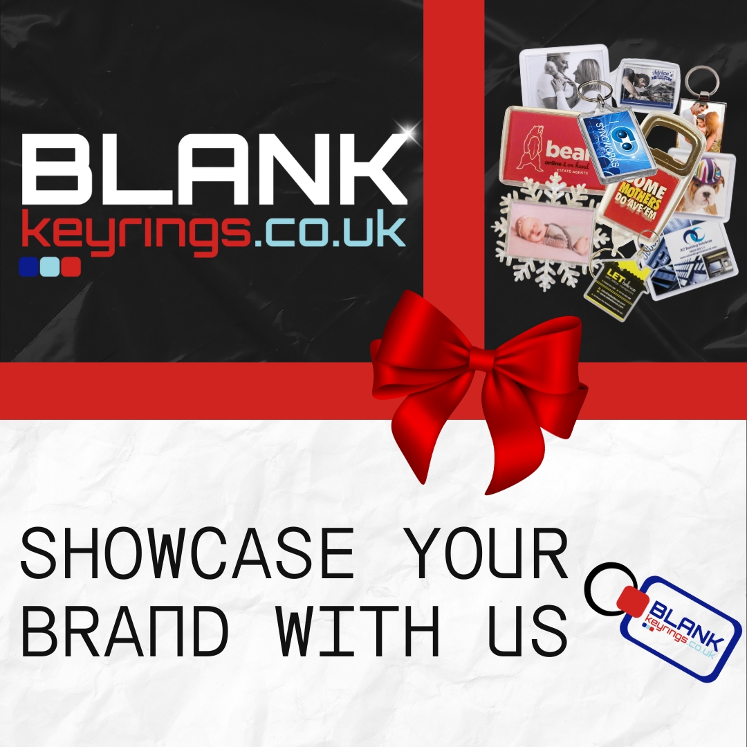
If you've been following us for a while, you might notice something different today. That’s right—BlankKeyRings.co.uk has had a makeover! Our logo and branding have been refreshed to better represent who we are, who we serve, and where we’re going. We couldn’t be more excited to share the details with you. Let’s have a peek behind the curtain at what’s changed, why we did it, and how this process can inspire your own branding journey.
Why We Refreshed Our Branding
After years of building relationships with hardworking business owners like you, we realised our logo and branding needed a little TLC. Don’t get us wrong—the red, blue, and white you’re familiar with isn’t going anywhere. But it was time to evolve.
Our customers are bold, hardworking, and creative, and our branding needed to reflect that energy. So, we stuck with our classic colours but gave them a modern twist by often pairing them with a striking black background. Black adds sophistication and makes the reds and blues pop like never before. The result? A logo that’s sharp, eye-catching, and as memorable as a great first impression.
Choosing a Logo for Impact
When it came to designing the new logo, we asked ourselves one key question: What would catch the eye of a mechanic handing out keyrings or a photographer selling custom photo gifts? The answer was something simple yet professional, modern but approachable.
We picked a clean, strong font that’s easy to read and looks just as good on a keyring as it does on a fridge magnet or a shipping label. Fonts might seem like a small detail, but trust us, they matter. A bold, straightforward font communicates reliability and professionalism—two things we know our customers care about.
And because many of you work in the trades or creative industries, we made sure the new logo stays versatile. Whether it’s printed on promotional materials, showcased on the website, or even embossed onto a product, it looks polished and purposeful.
The Power of Colour in Your Branding
Now, let’s talk colours. Sticking with our signature red, blue, and white was a no-brainer. These colours are classic, trustworthy, and recognisable. Red conveys energy and confidence, while blue signals trust and dependability. Add white to the mix for clarity, and you’ve got a combination that stands out without overwhelming the eye.
Here’s the kicker: using black as a backdrop elevates these colours, giving them a modern edge. It’s like putting a masterpiece in the perfect frame—it draws attention exactly where you want it. This little tweak made a world of difference, and I think it’ll resonate with our customers who value practicality with a touch of style.
Lessons You Can Apply to Your Branding
Refreshing our branding got us thinking about all the small businesses, tradespeople, and creatives we work with. If you’re considering updating your own logo, business cards, or marketing materials, here are a few things we learned along the way:
- Know Your Audience
Your brand is about more than just looking good—it’s about making a connection. Think about your customers. What do they value? What impression do you want to leave? If you’re a locksmith, for example, your branding should convey trust and security. If you’re a photographer, creativity and elegance might be your focus. - Keep It Simple
A clean, uncomplicated logo is more versatile and memorable than something overly detailed. It’s got to look just as good on a pen or keyring as it does on a website banner. Trust us, simplicity is your friend! - Be Consistent
Once you’ve chosen your colours and font, stick with them. Consistency helps people recognise your brand at a glance, whether they’re looking at your logo, your van signage, or your business card. - Think About Longevity
Trends come and go, but a great logo stands the test of time. Don’t get too caught up in flashy effects or styles that might feel dated in a few years. Choose something classic with just a hint of modern flair. - Invest in Versatility
Your branding needs to work across all mediums, from digital to print to physical products. That’s why we designed our new logo to look just as sharp on a black keyring as it does on a webpage. Make sure your logo can adapt to wherever your business takes you.
Our new logo is just the beginning. With our refreshed branding in place, we’re doubling down on what we do best: helping your business stand out. Whether you’re looking for blank keyrings, fridge magnets, bottle openers, or something seasonal like snow domes, our products are ready to showcase your creativity and make your brand unforgettable.
This redesign is a celebration of who we are and a commitment to supporting businesses like yours. After all, we’re not just selling blank products—we’re helping you build something bigger, whether it’s a loyal customer base, a thriving side hustle, or a memorable gift line.
Let Us Know Your Thoughts!
So, what do you think of the new look? Drop us a line and let us know—We would love to hear your thoughts. And if you’re inspired to refresh your own branding, remember: it doesn’t have to be complicated or expensive. Sometimes, a little tweak like adding a bold background or updating your font can make a world of difference.
Thanks for sticking with us on this journey, and here’s to a future full of creativity, growth, and keyrings that stand out from the crowd.
You can reach out to us on our Contact Form or by emailing us at sales@blankkeyrings.co.uk or you can connect with us our socials: Facebook, Instagram, X or LinkedIn.